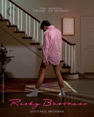
Didn't notice at first, but Risky Business is an illustration, not a cap, from the artist that did Criterion's Police Story and Throw Down covers.
Criterion & Eclipse Cover Art & Packaging Babble-on Vol. 7
-
dwk

- Joined: Sat Jun 12, 2010 6:10 pm
Re: Criterion & Eclipse Cover Art & Packaging Babble-on Vol. 7


Last edited by dwk on Mon Apr 15, 2024 12:41 pm, edited 1 time in total.
-
Matt

- Joined: Tue Nov 02, 2004 12:58 pm
Re: Criterion & Eclipse Cover Art & Packaging Babble-on Vol. 7
Le Samouraï seems to be a rare example of giving a completely new cover to what is a simple format upgrade and not a new addition with more supplements.
The old cover was perfect, one of their best.
The old cover was perfect, one of their best.
-
therewillbeblus

- Joined: Tue Dec 22, 2015 3:40 pm
Re: Criterion & Eclipse Cover Art & Packaging Babble-on Vol. 7
None are great, none are horrible - a curious choice for Perfect Days, but it's both in step with the spirit of the film and made me laugh in its bald irony
-
Kracker

- Joined: Sat Sep 28, 2013 2:06 pm
Re: Criterion & Eclipse Cover Art & Packaging Babble-on Vol. 7
and of course the Concubine cover gets to be the one that looks like garbage, dont recall that being original poster art or anything.
-
Walter Kurtz

- Joined: Sat Jul 25, 2020 3:03 pm
Re: Criterion & Eclipse Cover Art & Packaging Babble-on Vol. 7
Maybe the bifurcation between the colorful left-top and pure-red bottom-right is meant to visually highlight the political bifurcation/end of the happy/good times contrasted with the new austerity under the little RED book waving commies of Chairman Mao?
-
Walter Kurtz
- Joined: Sat Jul 25, 2020 3:03 pm
Re: Criterion & Eclipse Cover Art & Packaging Babble-on Vol. 7
Or is it simply that everyone who is in love (red) with Gong's acting is shocked (thus a shocking bifurcation) that she's finally in the collection?
-
Randall Maysin Again

- Joined: Tue Dec 14, 2021 3:28 pm
Re: Criterion & Eclipse Cover Art & Packaging Babble-on Vol. 7
Farewell, My Concubine is a thoroughly decent effort and the Rocha cover is actually pretty terrific!
-
dwk
- Joined: Sat Jun 12, 2010 6:10 pm
Re: Criterion & Eclipse Cover Art & Packaging Babble-on Vol. 7
Yeah, the title treatment is the real issue with Farewell's cover. Farewell crossing out of the red into the picture just looks sloppy.Finch wrote: ↑Mon Apr 15, 2024 12:37 pmI find the empty space on the Farewell cover baffling, too, and the placement of the word Farewell is really awkward. Skillman could have applied some shadow to the title fonts if he was concerned about the title not standing out enough against the busy background.
-
zedz

- Joined: Sun Nov 07, 2004 7:24 pm

-
zedz
- Joined: Sun Nov 07, 2004 7:24 pm
Re: Criterion & Eclipse Cover Art & Packaging Babble-on Vol. 7
That's the original poster, so Criterion only deserves credit for not screwing it up.Randall Maysin Again wrote: ↑Mon Apr 15, 2024 3:24 pmFarewell, My Concubine is a thoroughly decent effort and the Rocha cover is actually pretty terrific!

-
Walter Kurtz
- Joined: Sat Jul 25, 2020 3:03 pm
Re: Criterion & Eclipse Cover Art & Packaging Babble-on Vol. 7
But that may be shortchanging the genius of the person at Criterion who changed the red color from Pantone #485a to Pantone #485b!
-
afilmcionado
- Joined: Mon Sep 28, 2020 9:14 am
Re: Criterion & Eclipse Cover Art & Packaging Babble-on Vol. 7
I don’t aesthetically love the Farewell My Concubine cover but the idea is strong: the yellow and red combo is symbolic of the CCP, and it cuts through the image like a knife, with all the red almost like blood spilled.
-
Murdoch

- Joined: Sun Apr 20, 2008 11:59 pm
- Location: Upstate NY
Re: Criterion & Eclipse Cover Art & Packaging Babble-on Vol. 7
The Le Samouraï cover is terrible. The old cover was one of my earliest memories of seeing a Criterion cover, it's a shame they changed it.
-
cdnchris

- Site Admin
- Joined: Tue Nov 02, 2004 2:45 pm
- Location: Washington
- Contact:
Re: Criterion & Eclipse Cover Art & Packaging Babble-on Vol. 7
La haine [4K]
Picnic at Hanging Rock [4K] (Booklet)
I Am Cuba [4K]
Werckmeister Harmonies [4K]
Dogfight
Picnic at Hanging Rock [4K] (Booklet)
I Am Cuba [4K]
Werckmeister Harmonies [4K]
Dogfight